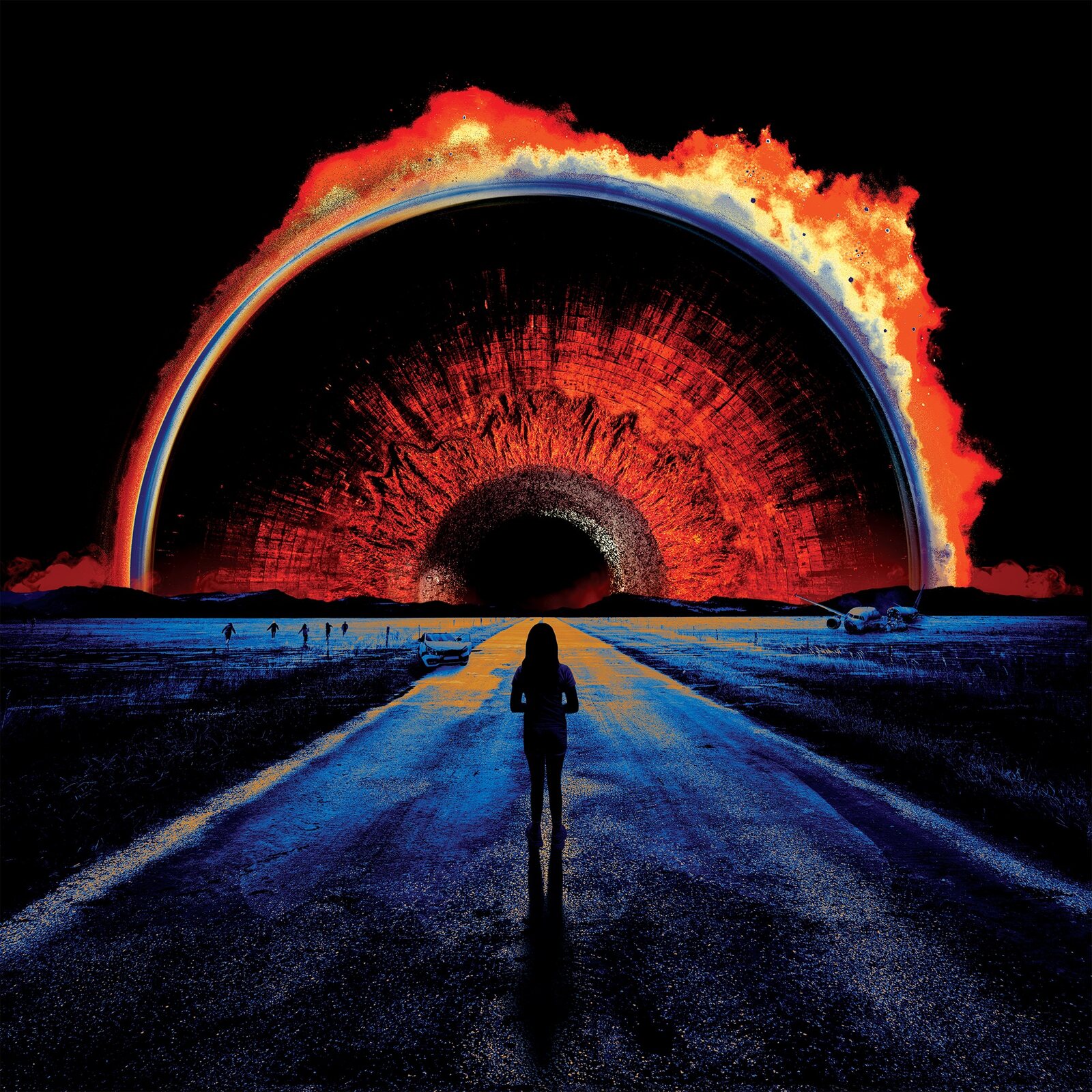
The Singularity: Ekleipsis album cover designed for Bear McCreary

Album Artwork · Bear McCreary

The Singularity: Ekleipsis

Cover, logo, and the full vinyl and CD package for the second chapter of Bear McCreary's symphonic metal saga.

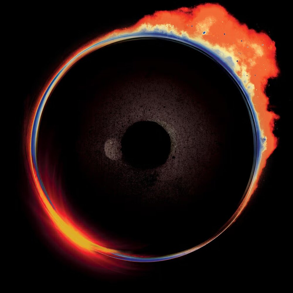
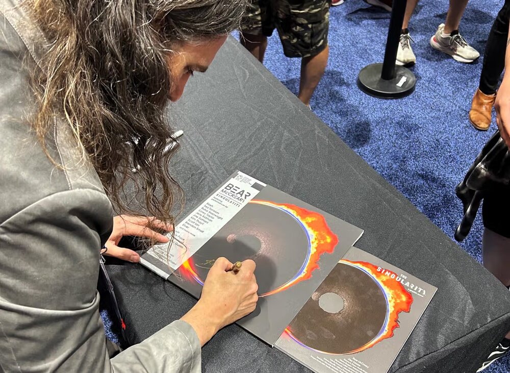
Bear McCreary is one of the great screen composers of his generation. The Singularity is the thing he makes for himself, a symphonic metal concept project with its own story and its own world. He brings aboard a wide variety of artists to collaborate with including Slash, Chad Johnson, Duff McKagan, Stewart Copeland, and Steve Vai, among others. I've designed for Bear for years, and in 2024 I had the pleasure of working with Bear on the cover of what would become the first album in a series of music releases under the name The Singularity. The cover I designed helped set the vibe for a world tour. It was used in elements of stage video and tour merchandise. It was used on the cover of the companion graphic novel that helped tell a visual story of the album's "narrative spine" as Bear later recounted.

When it came time for the second album, Ekleipsis, I had the honor to design all of it: the cover, the logo, and the physical package.

The Cover

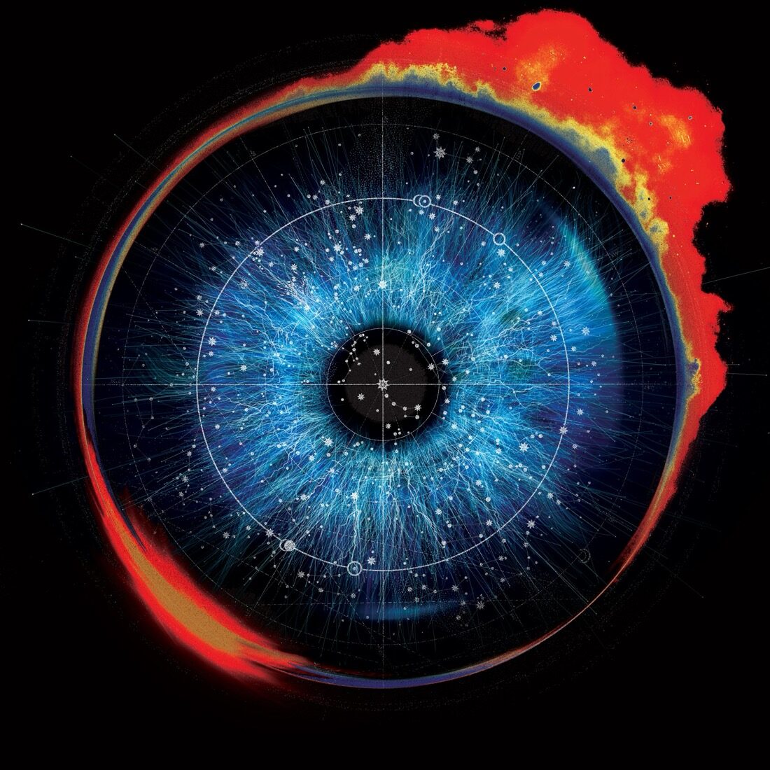
The brief wasn't a spec. It was the music. Rough demos, sent early, with a note that the vibes were there. And one instruction that shaped everything: don't start over, evolve it. The first Singularity cover had done its job across a whole album cycle. This wasn't a reboot. It was what happens next. We talked about maybe a simple addition of different colors, but the same basic design. Maybe the flames changed colors and shapes, or the whole orb rotated a bit. We envisioned a possible simple option that was just a subtle change. Based on the first album I knew that probably wouldn't be the case. But it's a good place to start. I knew that I would need to iterate for a while and see where that took me. It's how the first album cover happened. Not really a matter of throwing things against the wall and seeing what sticks. It's not quite that simple. You find the set of words and phrases that seem to have been said more than once and you keep repeating them to yourself as you work. Evolution, change, the sense of unrest and general unease in society, and the omnipresent sense that something doesn't feel right. And then later as the project evolved, a sense of resistance.

You find the set of words and phrases that seem to have been said more than once and you keep repeating them to yourself as you work.

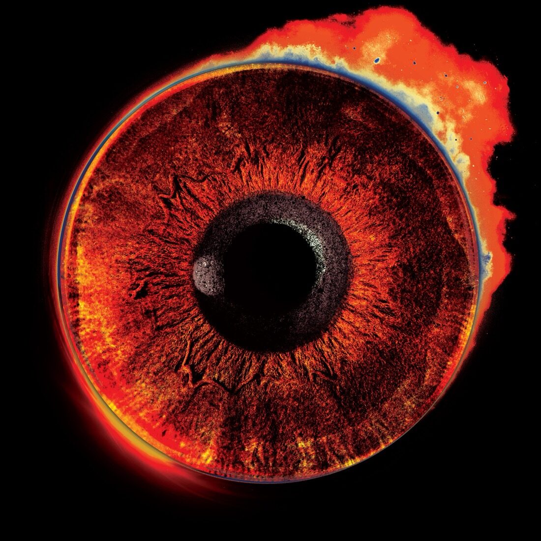
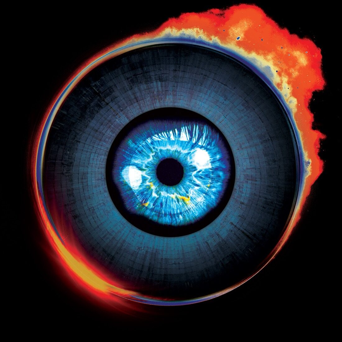
Bear gave me room, and a couple of touchstones. Guns N' Roses and Use Your Illusion I and II, one album in two colors, for the idea that this could be a version of something we'd already seen, continuing rather than restarting. And Pink Floyd's Pulse, with its photorealistic technique. That cover has an eye over a planet of sorts. The first Singularity cover already had a central element that read like a pupil, so leaning into an actual eye was just following the thread. I had actually tried some similar options when designing part 1.

The long search

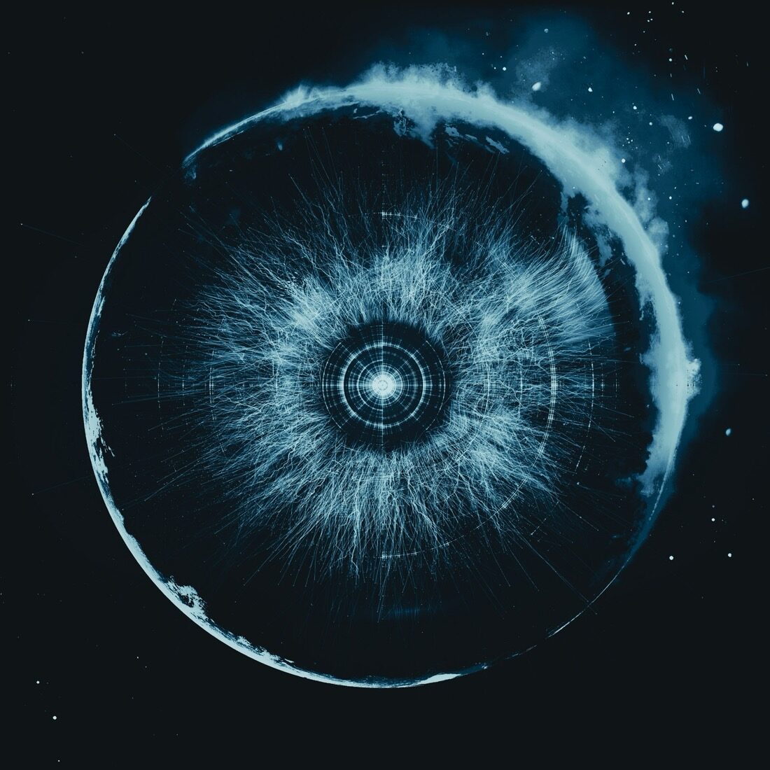
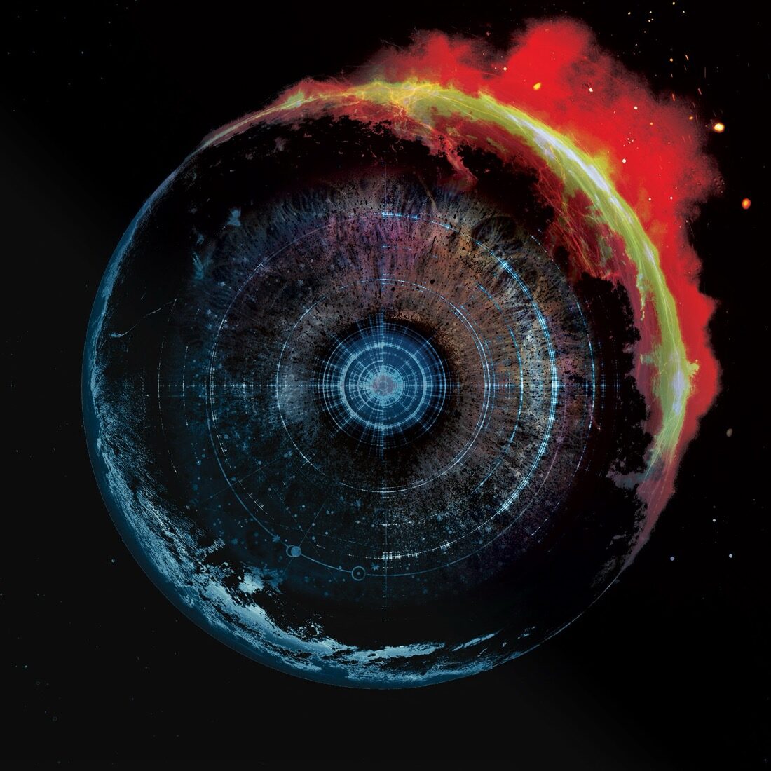
I work best by giving Bear a lot to react to. He knows the feeling when he sees it, and he needs to see options to find it. So I generated round after round: the eye at the center, different flames, different color casts, fire and ice, gold and blue. Some of it was good. None of it was right. There's an email in here where I told his manager, Joe, plainly, that I was losing perspective on where this should be going. We were stuck.

Ekleipsis album cover exploration, exploding circle
Ekleipsis album cover exploration, central eye
Ekleipsis album cover exploration, eye with stars
Ekleipsis album cover exploration, eye motif
Ekleipsis album cover exploration, fire and ice
Ekleipsis album cover exploration, collage with eye and figure
Ekleipsis album cover exploration, collage variation
Ekleipsis album cover exploration, photorealistic direction
Eight steps in the cover's evolution, from continuing the first album's eye to the composite that became the final.

The breakthrough

I had recently gone to a concert with my son, and the band had a backdrop behind the stage that stopped me. A lone figure on a beach, looking up at something, the whole scene built out of the wrong materials and pushed into off-key color: waves gone red, the beach made of something other than sand. The waves looked like a big piece of ribboned steak, yet still it was clearly a wave of some sort. It was hyper-real and impossible at once. I instantly knew this was an inspiration for the next Bear project that I hadn't even been asked to design yet. I took a photo of it that night, knowing that someday I'd do something for Bear and this would be the key. I was having a conversation with Joe about what to do next because we were at a bit of a standstill on where to take this. He mentioned that Bear thought we could maybe include more elements and that just the original art adjusted probably wasn't going to cut it. All of a sudden I remembered the photo I took and realized that it would be the key to unlock the art we were looking for.

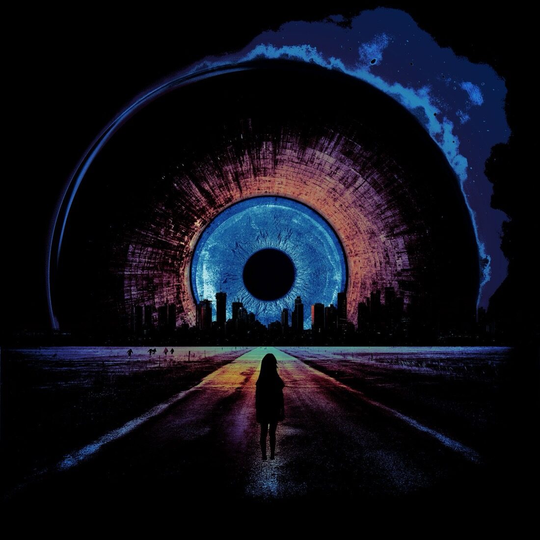
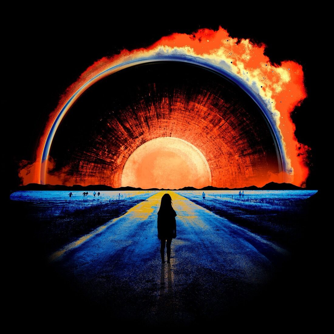
That was the day. I built my own version, our orb approaching a scene like that. I pulled together new options, and all at once it clicked for everyone. It wasn't finished, but something was finally happening. I tried different versions of a foreground planet, maybe earth, with The Singularity orb on the horizon. I wanted a character in the foreground indifferent to the grand moment in front of them. I found a stock vector of a young girl. I loved the idea of someone young being the one standing up to, not afraid of, the moment. The feeling I was reaching for was cinematic and ominous, the anticipation of something bad, but someone not fazed by it. Bear responded to this. We were finally on a path to something that was going to work. It was exciting. Bear referenced War of the Worlds. A planet being watched, reached for, closed in on by something enormous. Quietly, the album is about this moment we're living in: the sense that the world and its powers are always watching, overreaching, something dark and growing that you can't quite name. The image had to carry that on an abstract level.

Refinement

From there it became a composite, built and rebuilt in layers. A road, a car, people on the horizon, the singularity setting behind the mountains like a burning sun. Then Bear started pulling elements out of the songs themselves. There's a track called Black Box, so we crashed a plane into the field. We tried to lay a broken chandelier across the road for another song, but that one fought us, and we let it go. We went back and forth on how many people would be running towards the orb. For the girl on the road, we used a photograph Bear took himself, of someone he knew. That's her in the final. It made the whole thing personal.

Then the long dial-in. Mountains, smoke around the eye, a little more flame, the color pushed until it hummed.

The Singularity: Ekleipsis album cover designed for Bear McCreary
The final cover.

The Wordmark

The logo had a hard constraint built in. I've made Bear's identity for years. Bear McCreary is fixed, and the last album locked in The Singularity beneath it. So Ekleipsis was a third layer stacking onto two things that couldn't change. Three typefaces in one lockup, and it had to feel effortless instead of crowded.

My first instinct was to simplify. A clean, wide-set sans serif, letting air do the work. I gave Bear plenty of options in that direction, and I even thought it worked. He didn't, and he was right, so we kept going. One option I had thrown into the mix for variety was an interesting handwritten font. After a few rounds of trying different options, we finally returned to that script. It has more character than your normal script. It has an inky quality. I leaned into that. I added ink droplets to make it feel a little more immediate. Like it was written in a hurry. The sticking point was the E. Joe wanted it to feel handwritten, not built. "A sloppy, half-cursive kind of E," he said, not four careful pen strokes. It had the drippy, ink-pen feeling of Gerald Scarfe's illustrations for Pink Floyd's The Wall.

Early round of the Ekleipsis logo for Bear McCreary
Final Ekleipsis wordmark and logo lockup for Bear McCreary
An early round on the left, the approved lockup on the right. The hand-scripted Ekleipsis with its eclipse arc.

Ekleipsis is Greek for a failing, a forsaking, an abandonment. An eclipse. So the wordmark needed an eclipse in it. I built an Illustrator brush out of the font's own strokes and drew an arc with it, the edge of an eclipse, the moment right before something disappears. Then I worked it at angle after angle, adding ink drips until it read as one hand-made mark.

I built an Illustrator brush out of the font's own strokes and drew an arc with it.

When it finally landed, Joe's note said everything I needed to hear: "Logo #3 is approved. Go to town, brother."

The Package

For the vinyl and CD, Bear gave me one reference: Pink Floyd's Meddle. I couldn't have asked for better, because I've always loved Hipgnosis, the designers behind those early Floyd covers. I went out and bought the record, brought it home, put it on, and studied the art until I understood what Bear loved about it: the layering, the way you can't quite tell what you're looking at, and the texture. Years earlier, the first thing I ever designed for Bear was a soundtrack package for Da Vinci's Demons, and that was the piece that made him trust me with texture in the first place. So the brief was, in a way, made for me. Build something abstract, out of texture.

Metal, and something alive

The trick I took from Meddle was to layer images and texture until neither one is legible and a third thing appears. I pulled the materials straight out of the cover's own story: metal from the plane and the car, broken glass, smoke, fire, concrete, grass. But the thing that made it click was adding something biological. Blood, chemistry, a sense of disease, the War of the Worlds feeling of something spreading over everything. Metal plus biology. I downloaded a hundred images and started layering them in Photoshop, then dropped the cover's exact color cast over all of it so every surface felt like it came from the same world. After that, almost anything I put underneath started to look right.

Then, like the cover, the direction was the easy part and the refinement took some time. I pushed it too literal first. You could actually see the burned-out cockpit, the houses, the fire, and it was too much. Bear wanted it abstract, and he was right. What we kept is stranger and better: weathered car leather with blood bloomed over it, a cockpit dissolved into light flares, things you feel before you can name them.

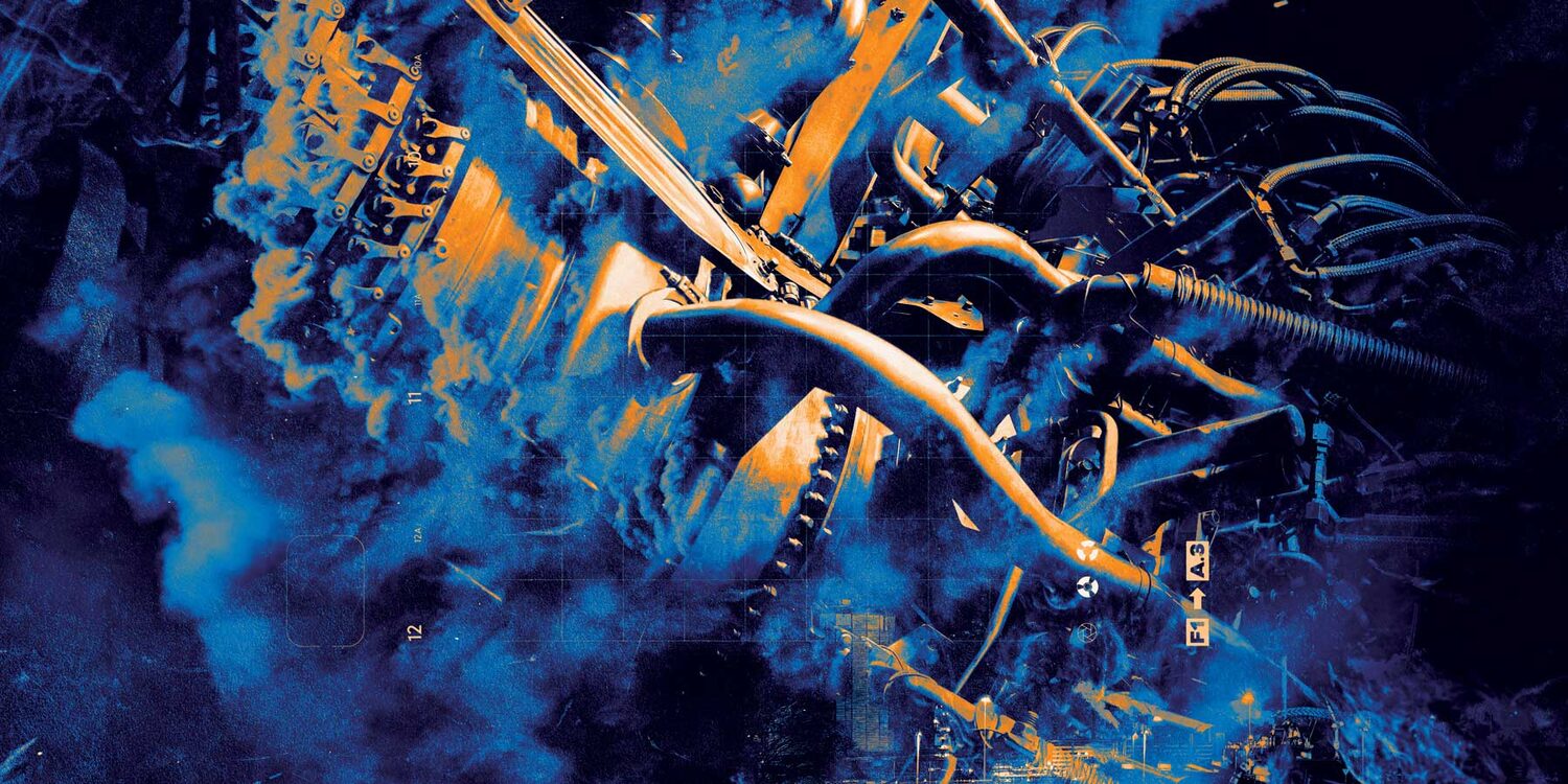
Ekleipsis packaging exploration, machinery textures
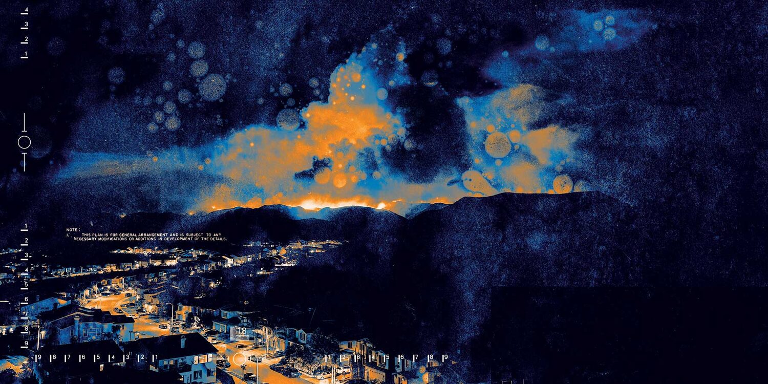
Ekleipsis packaging exploration, hillside on fire
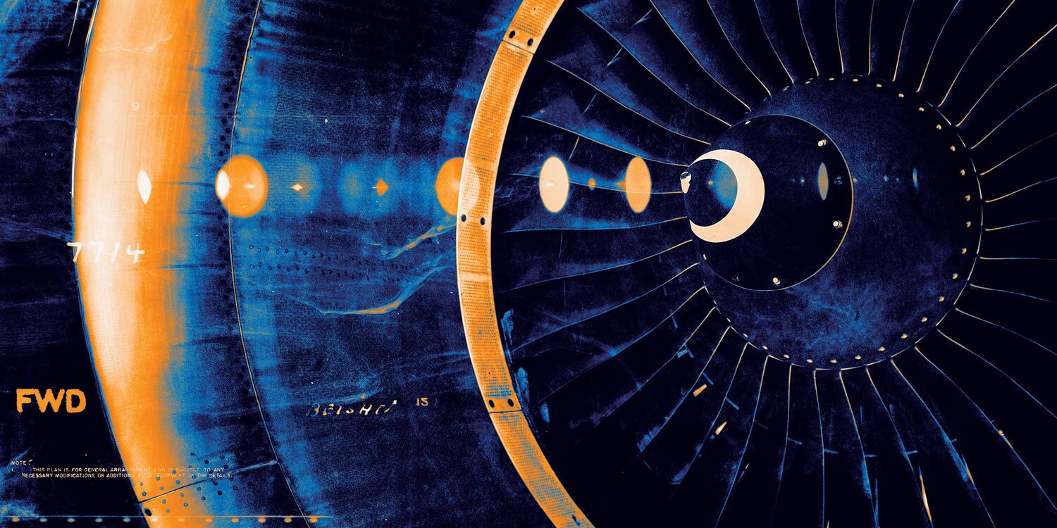
Ekleipsis packaging exploration, jet engine turbine
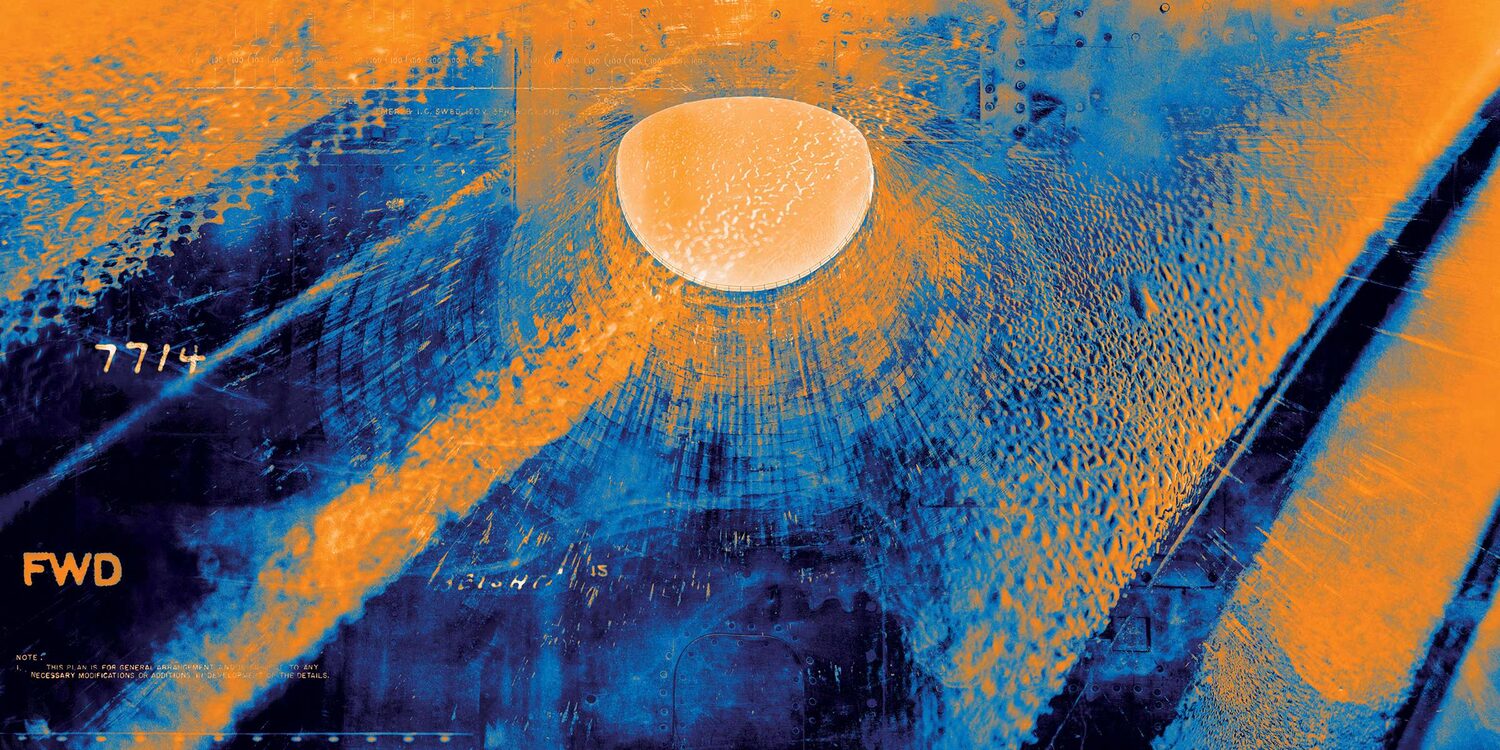
Ekleipsis packaging exploration, orb breaking through wreckage
Ekleipsis interior booklet spread with the wordmark
Explorations that didn't make the cut, pulled straight from the songs: machinery, a hillside on fire, a jet engine, an orb breaking through the wreckage, and an interior spread with the wordmark. Most were too literal to keep, but each one fed the textures in the finals.
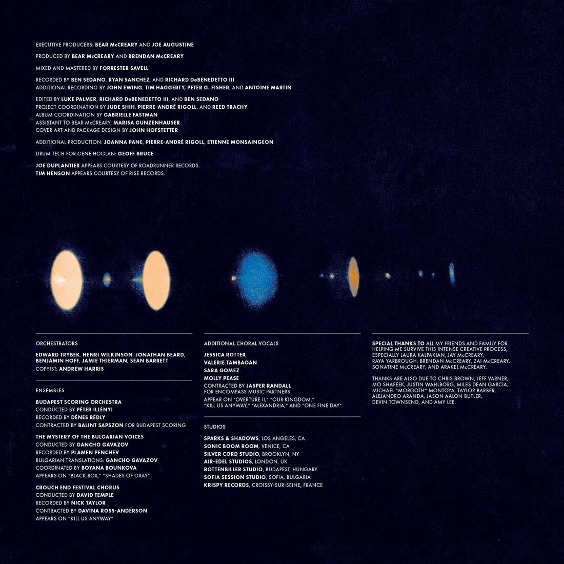
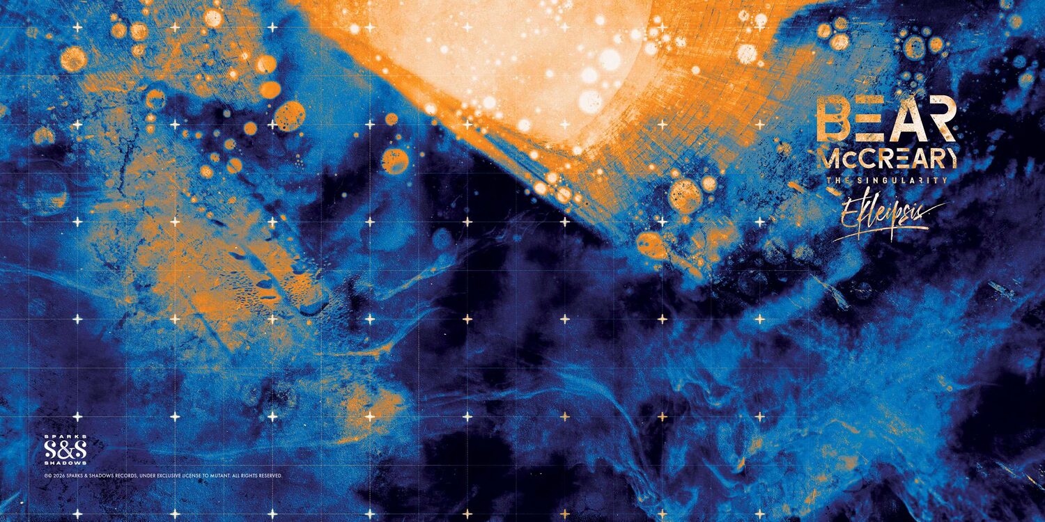
Ekleipsis vinyl gatefold artwork for Bear McCreary
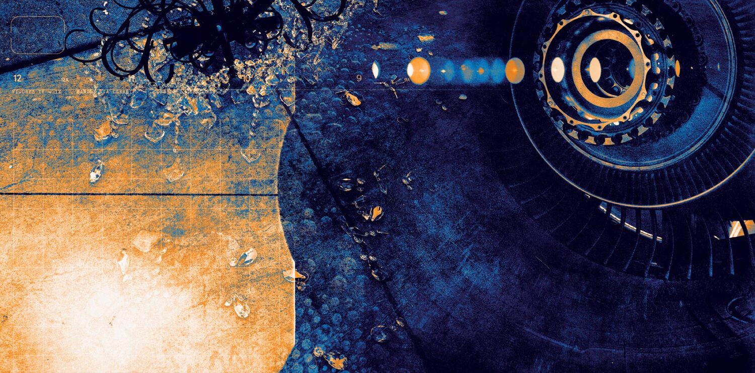
The gatefold. Bear's team bought a chandelier, smashed it, and sent me the photo. It's layered here with concrete, ink, flowers, and close-ups of airplane engines that read like a watching eye.

The gatefold is the piece that pulled it all together. The broken chandelier that never worked on the cover finally had a home. Bear's team literally bought one, dropped it, and photographed the wreckage for me. I built the spread out of seven or eight textures: the chandelier, ink, concrete, flowers in one corner, and abstract close-ups of airplane engines. I found a variety of images of airplane engine parts. They tie back to the crashed plane, but they also feel like some machine bearing down on you, and they're circular enough to read as another eye. You can't tell what any of it is. That's the whole point. It's the way an album felt for me when I was a kid, the art telling you a story you couldn't quite explain, that made you feel something anyway. Before I even knew what graphic design was I would sit and stare at vinyl packages like they were books. An open-ended story, like a set of lyrics that can mean anything to anyone.

Before I even knew what graphic design was I would stare at vinyl packages like they were books.

Type

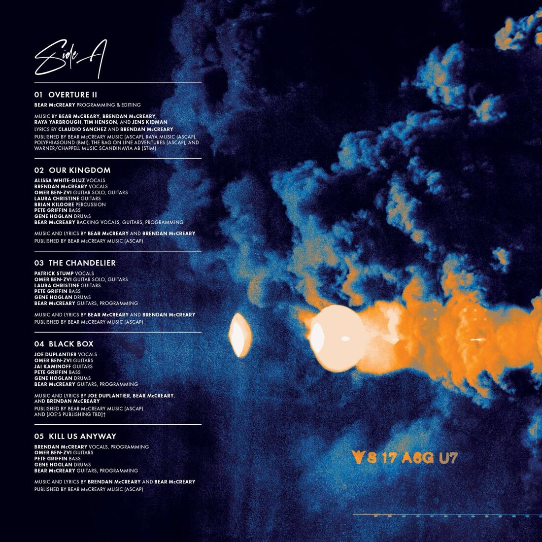
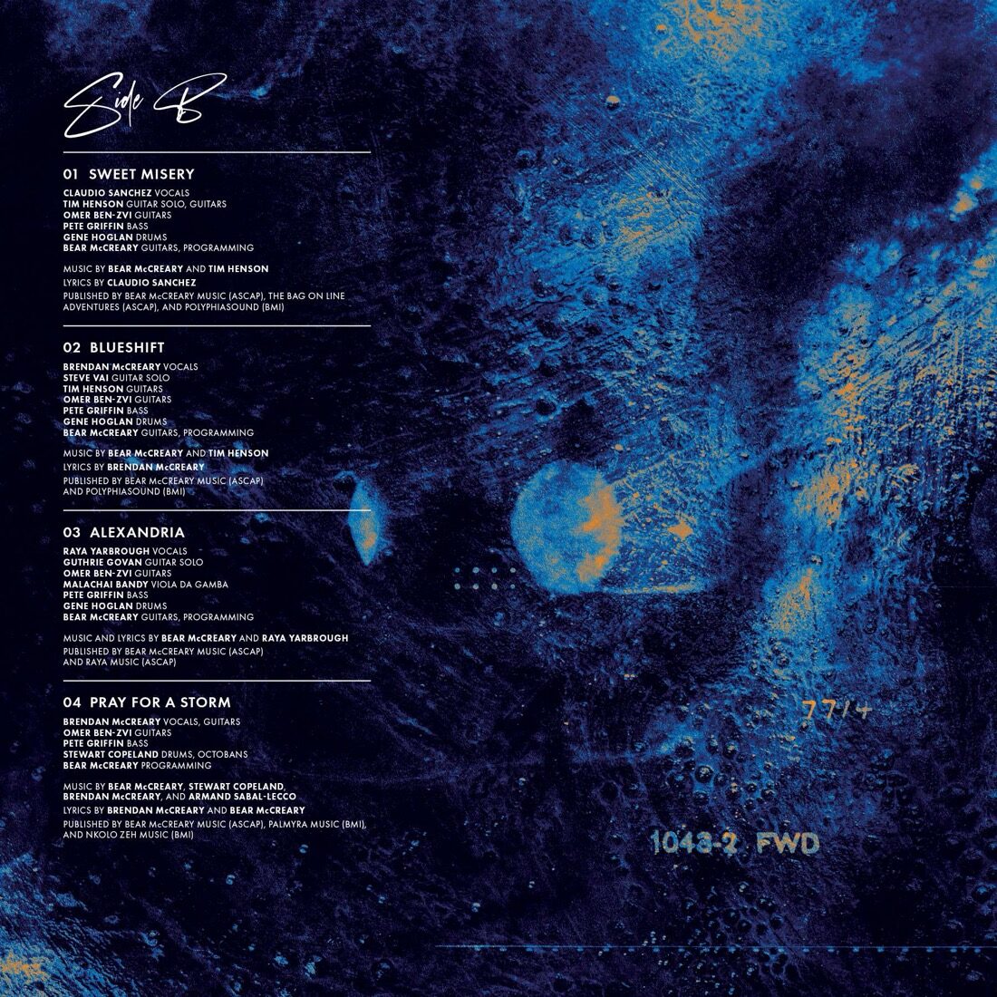
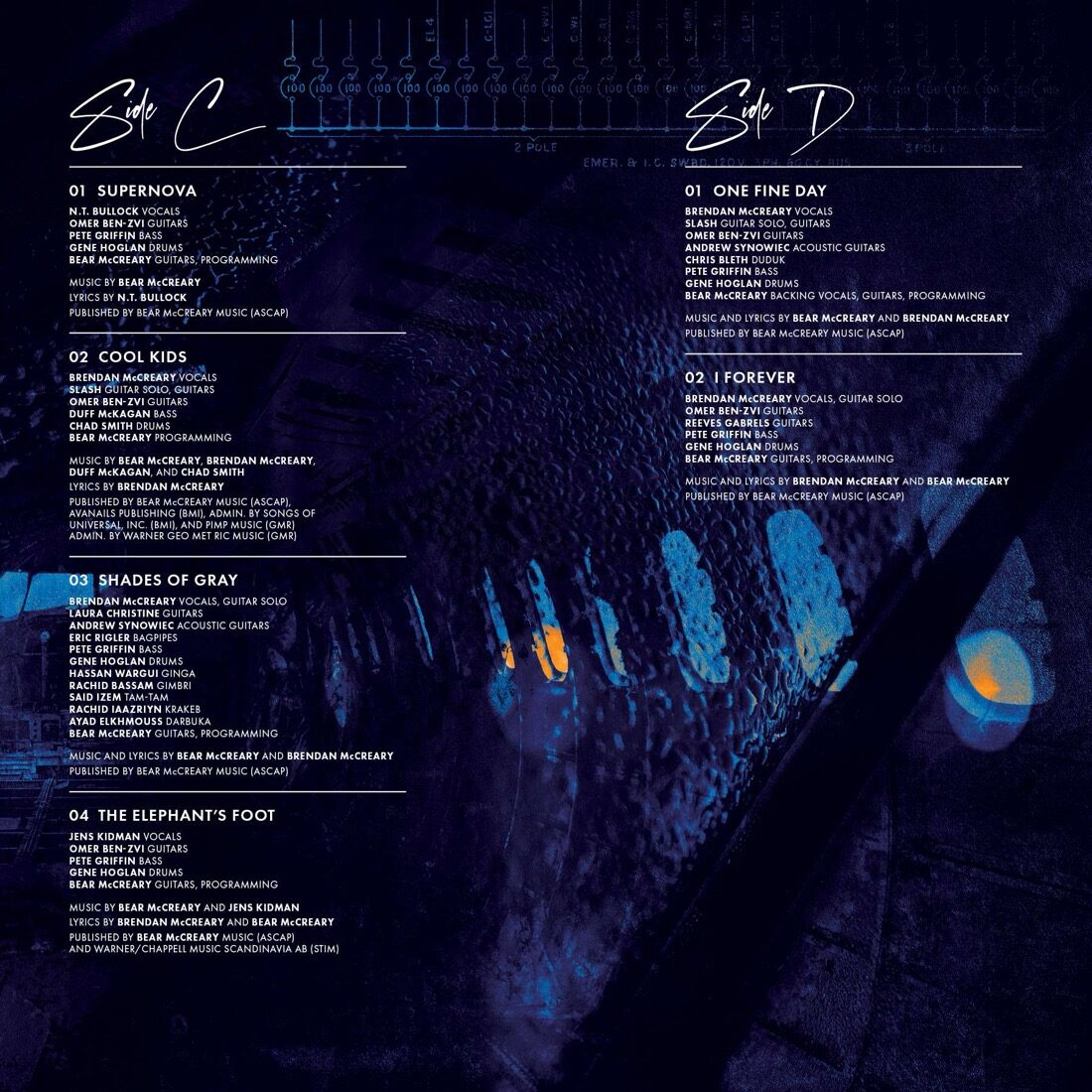
I researched what the early Pink Floyd designers used and how records were set in the '70s, and I kept the type dead clean, a simple all-caps, so the textures could do the talking. I went with Futura. The one flourish is that same script from the logo, used sparingly for the side markings, A, B, C, D. A nod to Scarfe and The Wall.

Ekleipsis vinyl record sleeve, Side A
Ekleipsis vinyl record sleeve, Side B
Ekleipsis vinyl record sleeve, Side C
Ekleipsis vinyl record sleeve, Side D
The four record sleeves. Track credits set clean over the textures, each side marked in the Ekleipsis script.
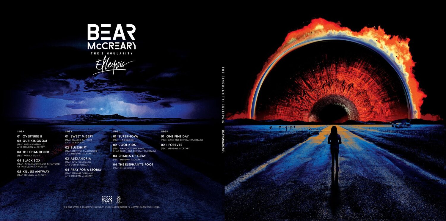
Ekleipsis vinyl jacket, front, spine, and back
The vinyl jacket: front, spine, and back.
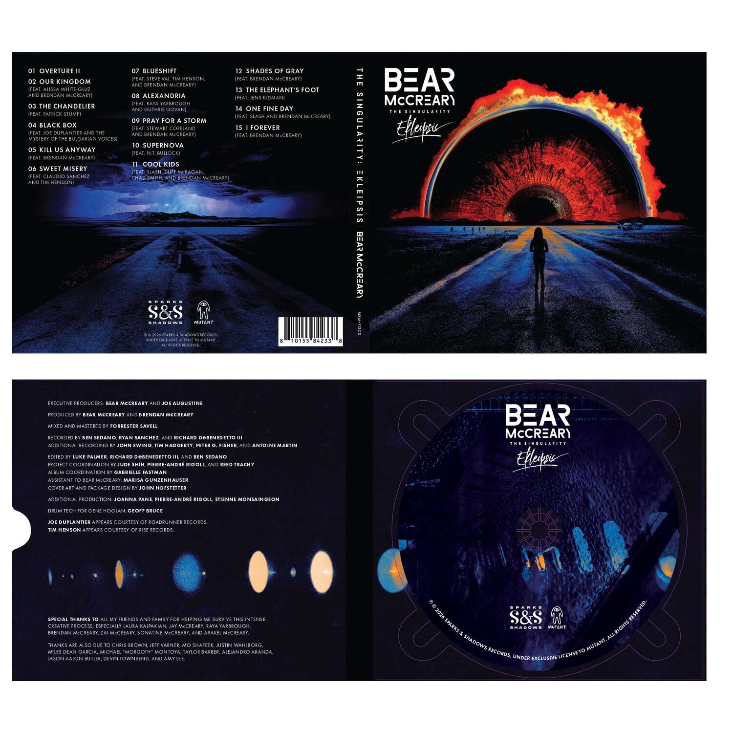
The Singularity: Ekleipsis CD digipak
The CD digipak.

When the panels came together, Joe wrote back the line I'll remember: "Look who got inspired last night. The sleeves are fantastic. This is going to be a killer package."

Released July 31, 2026

The Singularity: Ekleipsis arrived as a complete world. Cover, wordmark, vinyl, and CD, all cut from the same visual language.
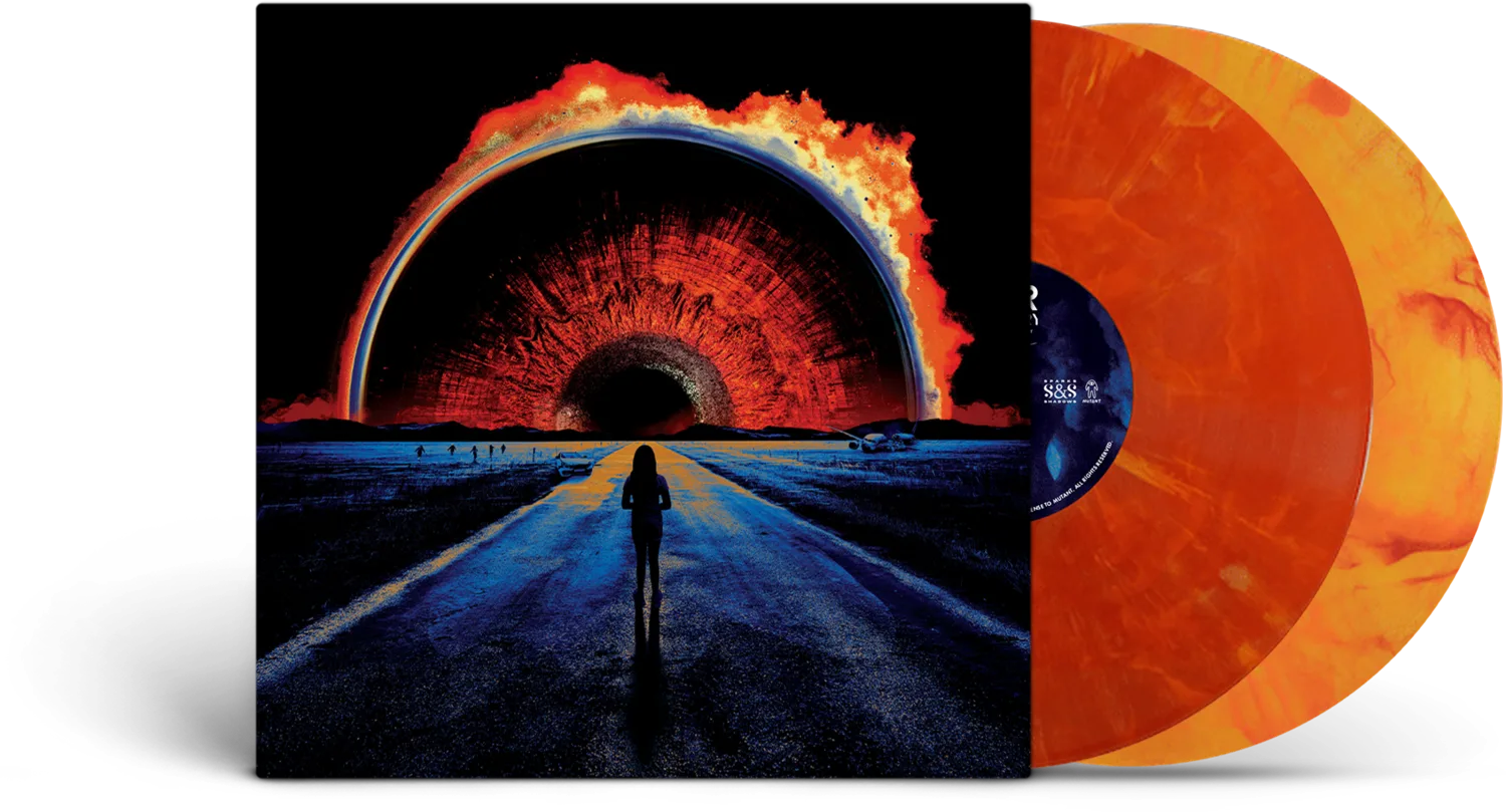
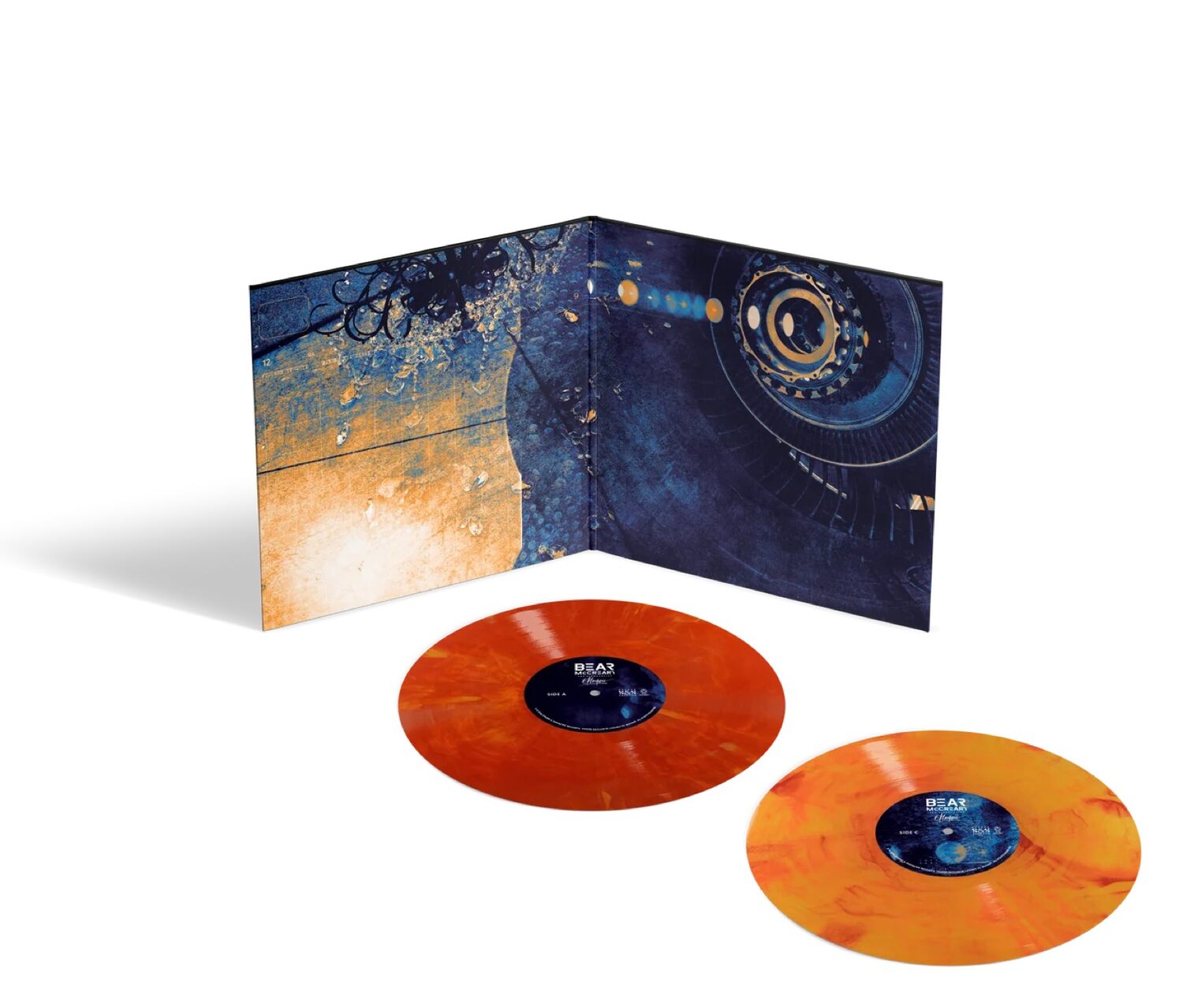
The finished Singularity: Ekleipsis vinyl release with color records
The complete release. Printed and pressed by Mutant.
Ekleipsis gatefold opened around the color vinyl
The finished gatefold, opened around the color vinyl. Printed and pressed by Mutant.

Design

John Hofstetter, State of the Design. Art direction, cover, logo, and complete vinyl and CD package.

Client

Bear McCreary · Sparks & Shadows.

Printing and Pressing

Mutant.