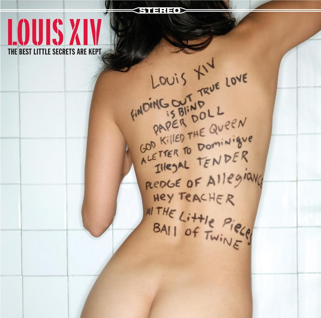
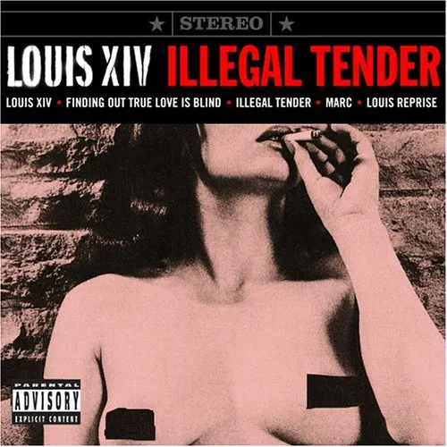
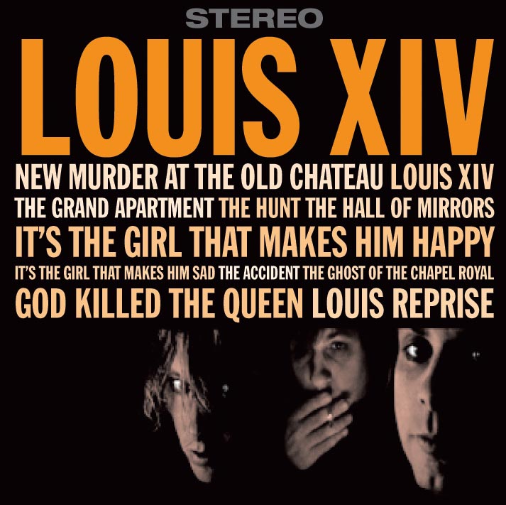
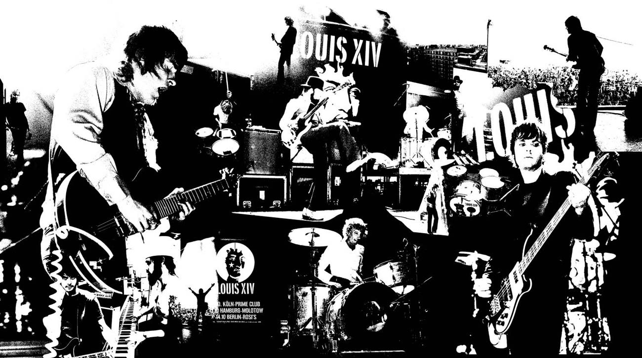
Client Case Study

Louis XIV

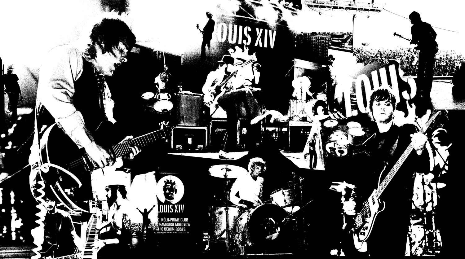
Louis XIV was an alternative rock band from San Diego that was popular in the early 2000s.

I met the band members when they operated under the name Convoy in the late 90s. I became great friends with the guys and designed the majority of their artwork.

Jason Hill and Brian Karscig were the creative musical force behind Louis. We would chat for hours about the approach we wanted to take with the band’s art. Since the music was reminiscent of 70s style glam rock, we would talk extensively about the artwork of bands like Roxy Music and Rolling Stones. I loved the style of vintage Blue Note records. I tried to give everything I designed for Louis XIV a vintage rock-meets-jazz vibe.

Since I was present for the genesis of Louis XIV, it gave me a chance to develop their full brand experience. When Louis signed with Atlantic Records, it opened up the floodgates of all new design opportunities. In addition to logos and album art, I created magazine ads, tour posters, backstage passes, calendars, websites, apparel, and more.

Unfortunately, the band eventually called it quits. They split into two new bands: The Nervous Wreckords (Brian Karscig) and Vicky Cryer (Jason Hill).

Louis XIV Logo

Brian sent me the cover of a book about the original French fellow Louis XIV, and I redrew his face in Illustrator. I love the way designer Shepard Fairey is able to distill a photo down to simple shapes and negative space for his art. I’d be lying if I said I wasn’t copying his style. I wanted the logo to work as a stencil when necessary so that they could spray paint it on their road rack cases. I ended up testing this by using an exacto blade to cut it out and then spray painting it in my garage. I ended up using the spray-painted version for a variety of CDs and posters.

Louis XIV (self-titled)

This was the first CD Louis XIV put out. They didn’t have a record label yet, so I had the jewel case inserts printed on a small 2-color printer in Boston. The photos were screenshots from a video for The Hunt that the band had made for a song on the album. I wanted the CD to look like the old jazz records put out by Blue Note, which often had song titles on the covers and shorts poem or lyrics on the back. So, I had Jason write a poem that I designed into the back of the CD. This was the first time I used Franklin Gothic Extra Condensed in a design for Louis XIV. I ended up using the font in just about every design I did for them from then on. It helped create the glue for the design language I was creating for them.

Illegal Tender EP

This was the first Louis XIV CD put out with the help of Atlantic Records. The music and lyrics had a sexual tone and we wanted to carry that through in the artwork. I bought a book of low-budget burlesque photos at Newbury Comics in Boston. The images had a natural, unproduced quality to them that would work perfect. Atlantic was able to secure the rights to a few of the images that we ended up using. I carried on with a similar aesthetic as the cover for the self-titled CD.

The Best Little Secrets are Kept

Atlantic Records flew me to Los Angeles for the photo shoot for this CD. I wrote a story about it here. After the CD was released, I designed a variety of artwork for advertisements and tour art. It was a pretty amazing experience.

Artwork Gallery (click image to view gallery)

The Distances from Everyone to You EP

This was an EP the band put out between proper album releases. I had been playing around with the images I used on the cover for a while and was glad to finally have a home for them.

Slick Dogs and Ponies

This was the follow-up to The Best Little Secrets are Kept. Once again, Atlantic Records flew me to California for the photoshoot. We started at Villa Montezuma, where we shot a series of photos that ended up being used for promo and on the inside of the album and CD art. However, we didn’t feel like we had anything right for the cover. Therefore, we ended up moving the shoot out to Jason’s mother’s house in Jamul. The shoot went into the night and the photographer, Jennifer Tzar, began taking what ended up being the final cover images. They have a mysterious shadowy vibe that was actually reminiscent of the images on the cover of the self-titled CD we did. I returned to a similar type treatment from the self-titled album as well for this cover.

Louis XIV Posters

I did a variety of posters over the years as you can see below. My favorite is the poster in which I hand wrote the dates with a Sharpie next to a photo I took of Brian during the photoshoot for The Best Little Secrets are Kept. This ended up being used for a national tour that Louis did with The Killers.

Poster Gallery

TOP